
Intuitive Connections (part 1)
- posted January 7, 2025
How can skeuomorphic design help engagement in exhibitions and museum interpretation?
When starting study for my MA in Heritage and Interpretation I parked graphic design for a little while. For the initial 6 months I fully immersed myself in heritage and museum studies theory. But as I approached my final dissertation project, I found myself coming full-circle back to graphic design. I decided to do a deep-dive into a design style that has been prevalent in the heritage world for many years, but has flown under the radar in terms of critical study.
Skeuomorphic design uses visual cues to mimic real-world objects or material properties. Using skeuomorphism can be as simple as texture or shadow, through to the curled edge of a photograph in digital interactives or set graphics in an immersive exhibition. It has often been used in the commercial design field to help an audience feel more familiar with something (such as new technology) to aid understanding and engagement.
It is underpinned by the theory of affordances, in which design features give clues of how to interact or respond to something. My research project aimed to understand these psychological theories underpinning skeuomorphic design, the decisions surrounding its use in museum and exhibition contexts, and find the most effective recommendations for use and further research.
Over the next few weeks I’m going to post a cutdown version of this project on my blog, but a full version is available on request. Before I crack on, I’d just like to take a second to send a massive thanks to my interviewees for generously giving their time: Jona Piehl, David Sudlow, Liz Peniston, Richard Playford, Leanne Clydesdale & Alec Hawkins.
Thanks also to those who gave me invaluable support and advice (even if some of you were cut from the final edit – sorry!): Lucy Harland, Fuzzy Duck, Bebhinn / Philippa / Suzanne @ Make Things Happen, Heritage Interactive, Yvonne Golds.
What is skeuomorphic design?
In interpretation and exhibition development there has been recognition that graphic design is no longer just a packaging for messages but recognised as an integral part of successful visitor experience (Macdonald, 2007, p.150). The theory of design as interpretation (Skolnick, 2005) acknowledges the power of graphic design as a key part of integrated exhibition design. Graphic design in a museum context spans pre-entry advertising, wayfinding signage and guidebooks, through to almost every surface of exhibition and display areas, including traditional wall panels, large-scale wallpapers, object labels, decorative set pieces, physical interactive elements and digital screen displays. When creating successful interpretive experiences, design teams develop visual languages that aim to be symbiotic with the text, objects and other media in the space.
This research study aims to be a theoretical but practical guide through visual style development for exhibitions and interpretive interventions, demystifying graphic design choices and their potential impact by focusing on one specific technique: skeuomorphic design.
An online search of the term ‘skeuomorphic design’ instantly returns thousands of results, mostly related to the field of digital interface design. In this context, it is the process of imitating physical properties, such as an object or texture, on a digital screen without retaining the full original function of the thing it’s imitating (Fig. 1). The term was coined in 1989 by amateur archaeologist, Henry Colley March, to describe the elaborate decoration prominent in material design of the era. The word itself is a combination of the Greek skeuos, meaning tool or container, and morphe, meaning exterior form (Anderson, 2019). In most instances from this era, when many making processes were beginning to be industrialised, some design features no longer had functional use but were imitated as a visual cue to earlier versions to carry through some idea of craft and therefore value (Fig. 2).
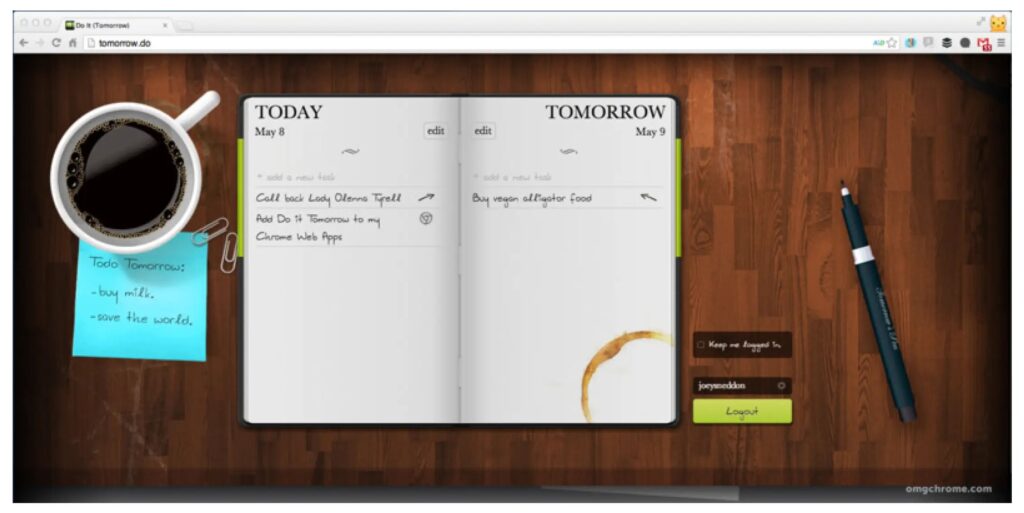
Figure 1. An image from an online application that uses skeuomorphic design. The coffee mug, stain, pen and wooden table have no functional ‘use’ in this context.(Image: Ellis and Marshal, 2019)
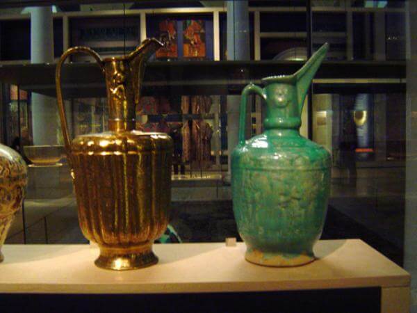
Figure 2. Vessels from the Chinese ceramic collection at the V&A. The handles no longer have functional use but are a skeuomorph that is retained from earlier iterations.
(Image: Steve Dixon, 2009)
Although conceptualised in the 1800s, the term was adopted to explain even older artefacts where new materials had been used to imitate older objects and processes. Basalla (1988, p.109) hypothesised that the use of skeuomorphs in crafts and making is a resistance to change; most crafts are handed down through generations so when new materials and processes were developed, skeuomorphic elements were retained to help acclimatisation with change by creating intuitive connections to cultural identities using nostalgia (Fig. 3). These new vessels evoke one material by referencing another; not only does this create a visual cue, but also transfers some of the same economic, social, and emotional value to the new skeuomorphic-designed object (Flores, 2023).
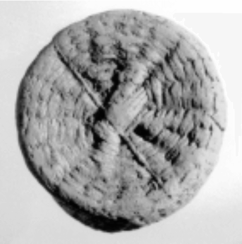
Figure 3. Some Bronze age Minoan pottery contained basketry patterns made by pressing original weaved baskets into raw clay. (Image: École Française d’Athènes. reproduced in Knappett, 2002)
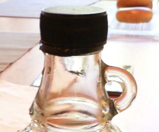
Figure 4. Maple syrup bottle. (Image: Brett, reproduced in Messier, 2012)
We can still see this today in the most arbitrary of situations; bottles of maple syrup are packaged in vessels with tiny handles, much too small for fingers (Fig. 4), so why keep them as part of the bottle design? These tiny handles are a skeuomorph of a time when maple syrup vessels were much larger and the handle aided them being carried. Now no longer needed for a functional reason, they are retained as they have become ubiquitous with maple syrup, as a visual cue of an ‘authentic’ product (Messier, 2012).
Like any industry or knowledge system, design is connected to paradigm shifts that profoundly change the way we understand and interact with the world (Chalmers, 2013). To aid smooth transitions in such shifts of materials, technology or ideas, a successful innovation moves the viewer to the new by using the familiar (Flavin, 2021). Flavin presents skeuomorphic design as a tool used in disruptive innovations that preclude a paradigm shift. They rely on referencing current perspectives to drive desired responses to a new knowledge system. The most notorious use of skeuomorphic design is present at a highly disruptive shift in human history: the development of domestic computing, the internet and mobile technology. Designers incorporated familiar symbols on early desktop computer interfaces, such as trash can icons and wooden textures (see Fig. 5) aimed at creating links to existing visual cues of pre-computing users.
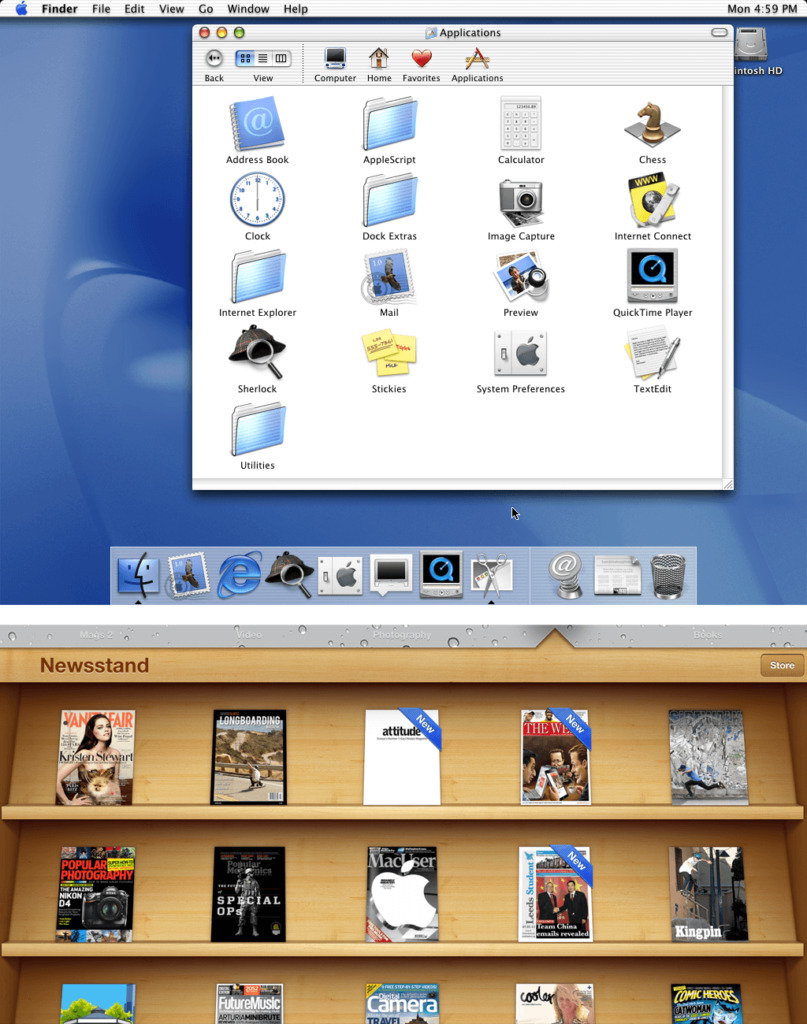
Figure 5. Top – icon design on early Apple operating systems. (Image: Nick Babich, 2022)
Bottom – the newsstand app on early iPhones using a wooden skeuomorphic background. (Image: Keith Martin, 2011)
As desktop computers slowly rose in use this form of skeuomorph became mainstream with the release of the first Apple iPhone in 2007. Up until that point users had only interacted with desktop-based systems and basic mobile handsets, but now with the introduction of smartphones, the function of a mobile handset rapidly expanded. Not only could it make calls and texts but housed all manner of applications that integrated with the now-established world wide web. To ease adoption, sales and longevity of its product, Apple utilised skeuomorphic design principles more heavily than any in the field of computing before it. In the years since Apple revolutionised the digital landscape, many others followed suit, with the style becoming ubiquitous. However, with all trends comes their inevitable downfall. Around 2012 there was a growing backlash to skeuomorphic design in favour of flat design (Fig. 6). This could be seen in both digital environments and across all aspects of the graphic design field such as branding and logo design, advertising and more.
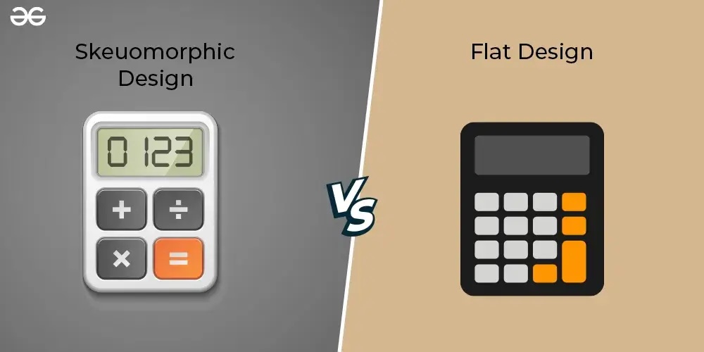
Figure 6. Side-by-side examples of skeuomorphic
design versus flat design. In flat design, elements that reference shadows, light, texture or depth are not present.
(Image: geeksforgeeks.org, 2024)
Digital language had evolved since the first iPhone and there was encouragement from many sides to believe audiences were more digitally literate than persisting skeuomorphic designers gave them credit for (Design Week Online, 2013). Many insisted that flat design principles offered visual clarity and understanding without compromising usability that was seen as a flaw of skeuomorphic principles (Interaction Design Foundation, 2023). This can be seen as a key moment where society shifted from between two paradigms; the first existed in a time of digitally illiterate audiences where skeuomorphism was deemed necessary to aid understanding and adoption. In the second, skeuomorphic principles are now mostly viewed as a tool to create experiences rather than a need to facilitate functional use (Design Week Online, 2013). Wiberg (2018) suggests that we need to move away from metaphors and symbols which reinforce a divide between physical and computing worlds and look towards an integrated approach. Furthermore, an A/B study of flat versus skeuomorphic design casts doubt on those early claims that it ubiquitously aids functional accessibility (Oswald, 2018). Results suggest skeuomorphic design elements are more successful when used sparingly and deliberately to avoid confusing the user.
In the shadow of criticisms there has been a slow uptick in digital interface designers revisiting skeuomorphic design principles in a drive to get the best of both worlds; design that engages the existing mental models that skeuomorphic elements thrive on, but strips away some of the so-called superfluous aesthetics which some studies have shown to overwhelm people (Spiliotopoulos, Rigou and Sirmakessis, 2018). Many are critical of completely eradicating skeuomorphic design, making the case that it remains a valid way to communicate familiarity to facilitate engagement, especially to those with less technical skills or prior knowledge of a subject (Fitzgerald, 2022; Thalion, 2017). Others suggest it should be used to imitate physical functionality, not just visual characteristics such as shape and material (Borowska, 2013). Proponents of flat design insist focusing most attention of functionality over aesthetics makes for a more streamlined and successful experience (Peker, 2023). All this has led to a half-way house approach termed variously as neomorphism (Fitzgerald, 2022), skeuo-minimalism (Urbano, Guerreiro and Nicolau, 2022, p.453) and material design (Peker, 2023) All have aspects of flat design with added skeuomorphic elements such as textures, shadows and references to physical objects or interactions (Fig. 7).
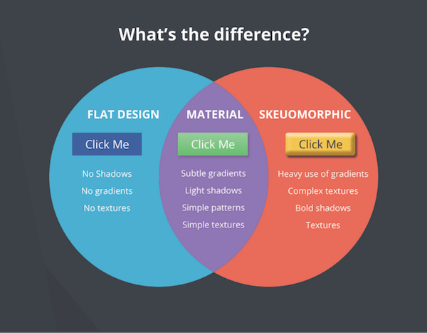
Figure 7. Definitions of flat, material and skeuomorphic design style.
(Image: devopedia.org)
Reclaiming skeuomorphic design from digital interface discourse
This chapter began by unearthing the roots of skeuomorphic design in human crafts and making. While discourse morphed primarily to its context within digital interface design, there has been a constancy of skeuomorphic design in physical contexts. Much the same as the maple syrup bottle mentioned earlier, there are similar examples of artefacts we use in everyday life that retain visual references to material properties to cue a particular feeling, use or authenticity (Fig. 8). More broadly, there are many examples in contemporary visual culture, particularly those which rely on ‘retro’ styling (Fig. 9) and prop design for film and television (Fig. 10). This can be seen as a continuation of using skeuomorphic elements to create intuitive emotional connections to the past by evoking characteristics that draw upon prior meanings or associations we have with that object (Watson, 2023).
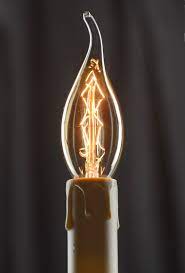
Figure 8. A modern candle bulb can be considered a skeuomorph, as its design is retaining the shape of a flame.
(Image: saving-light-bulbs.co.uk)
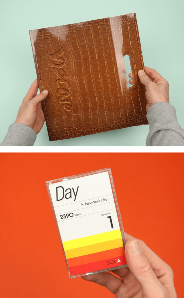
Figure 9. Magazine design which uses skeuomorphic design to create cassette-inspired and leather covered magazines.
(Image: Watson, 2023)
Despite these contemporary physical uses of skeuomorphic design, the critical discourse is still overwhelmingly centred within the field of digital interface design. As Chandler argues in her thesis on skeuomorphs in material practice, this current digital focus obscures the “immanent materiality and purposiveness” (2016, p.3) of skeuomorphs. Inspired by Chandler, this essay seeks to examine the potential of skeuomorphic design in the museum and cultural sector; one that has objects and materiality at its core.
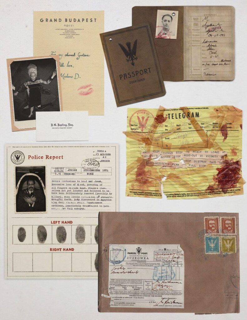
Figure 10. Perhaps the most abundant but inconspicuous example of contemporary skeuomorphic design is in the world of film and television graphic props. These are arguably the very definition of skeuomorphic design, as they no longer serve their original use but retain some physical properties.
(Image: Annie Atkins, 2020)
Skeuomorphic design works by mapping something new onto our existing cognitive framework (Gessler, 2005). It embraces our innate preference for something familiar and responds to humans’ predisposition to materiality (Cole, 2018; Janusheske, 2012). In the late 1980s, psychologist James Gibson introduced the concept of affordances (Fig. 11). He theorised that all objects and material things have inherent qualities or properties that give humans clues for their possible uses or how to understand them (Gibson, 1986).
In subsequent years, Norman (1988) developed the work of Gibson in the field of human-centred design, focusing on ending frustrations with the design of everyday things. He theorised that successful design relies on the appropriate deployment of affordances; elements of design that can signal how we should interact with something. While affordances can be inherent in material properties, they are also unique to a person’s internal or societal frameworks. Gibson gives the example of a postbox; the object of a postbox only affords letter-posting to a “letter-writing human in a community with a postal system” (1986, p.139).
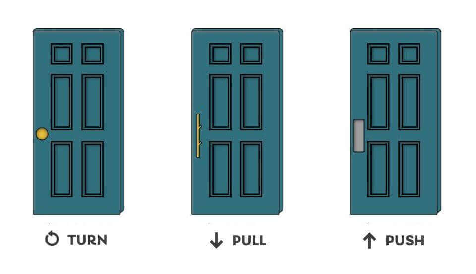
Figure 11. example of affordance. On a well-designed door, the handle will give a clue on how it is to be opened.
(Image: Chris Myhill, 2023)
Historic and contemporary use of skeuomorphic design has always facilitated people becoming comfortable with new materials, knowledge or technology. They required cognitive links to existing internal knowledge frameworks to adopt new ways of interacting and learning. The common intent behind skeuomorphic design in referencing physical attributes was to transfer their original inherent properties to the new application to “maintain the connections between materiality and function in spite of a change in material” (Gross, Bardzell and Bardzell, 2014, p.59). The idea of skeuomorphic design as a tool to aid adoption of new ideas or increase understanding can be applied to how visitors engage with a topic outside of their current knowledge framework in museum settings. Leveraging the original material-focussed aspects of skeuomorphic principles reveals scope to liberate them from the digital-led discourse and utilise them in encouraging embodied experiences in exhibitions and interpretation. Nevertheless, there must be vigilance of shifting design trends and how skeuomorphism can be used with longevity and relevance to museum audiences by providing “creative dissonance rather than fake familiarity” (Watson, 2023). In this context, can the principles of skeuomorphic design transcend just usability and affect physical and emotional engagement?
Part 2 coming soon…
Reference List
Anderson, A. (2019) Word: Skeuomorph. Available at: https://www.kinfolk.com/word-skeuomorph (Accessed: 23 January 2024).
Atkins, A. (2020) Fake Love Letters, Forged Telegrams and Prison Escape Maps: Designing Graphic Props for Filmmaking. London: Phaidon Press.
Basalla, G. (1988) ‘IV – novelty (2): Socioeconomic and cultural factors: ‘The evolution of technology. Cambridge: Cambridge University Press, pp. 103-134.
Chalmers, A. (2013) ‘Theories as structures I: Kuhn’s paradigms’ in What Is This Thing Called Science? 4th edn. St Lucia, Australia: University of Queensland Press, pp. 161-192.
Chandler, K.J.L. (2016) In the making: An interdisciplinary revision of the concept of the skeuomorph for material practice. PhD thesis. University of Brighton.
Macdonald, S. (2007) ‘Interconnecting: Museum Visiting and Exhibition Design’, CoDesign. 3, pp. 149-162.
Messier, J. (2012) Why do maple syrup containers have tiny handles? Available at: https://brooklynbrainery.com/blog/why-do-maple-syrup-containers-have-tiny-handles (Accessed: 13 September 2023).
Piehl, J. (2021) Graphic Design in Museum Exhibitions: Display, Identity and Narrative. London: Routledge Taylor & Francis Group.
Skolnick, L.H. (2005) ‘Towards a new museum architecture: Narrative and representation’, in Macleod, S. (ed.) Reshaping Museum Space. Florence: Taylor & Francis Group, pp. 132-144.
Watson, S. (2023) Skeuomorphic magazine design turns print into play. Available at: https://www.printmag.com/print-design/skeuomorphic-magazine-design/ (Accessed: 27 October 2023).Wiberg, M. (2018) The Materiality of Interaction: Notes on the Materials of Interaction Design. Cambridge: MIT Press.